
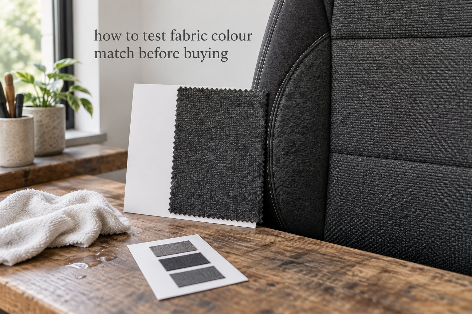
If you are searching for how to test fabric colour match before buying, the short version is this: hold the new fabric against what it has to match, edge to edge, in indirect daylight, and let your eyes settle for thirty seconds before you judge anything. Most bad matches are not caused by a wrong colour being sold to you. They are caused by judging two fabrics under the wrong light, from the wrong angle, with a gap between them, on a background that is throwing colour onto both samples. Once you remove those variables, a good match and a bad match are usually obvious within a few seconds. This guide walks through five physical test methods, the dye-lot trap that catches out large orders, and what to do when the match simply is not exact. It is written for anyone matching fabric to something they already own — car seats and door cards, furniture, or a garment repair.
Table of Contents
- How to Test Fabric Colour Match Before Buying
- Test Methods at a Glance
- Why Colours Look Different in the Shop Than in the Car
- Method 1 – Compare Under Natural Daylight
- Method 2 – Use a Neutral Background and Stand Behind White Card
- Method 3 – The Damp White Cloth Wet-Rub Test
- Method 4 – The Phone Check (and Why It Is Only a Rough Guide)
- Method 5 – Ask for a Physical Swatch or Sample Before You Buy
- Dye Lots and Why One Continuous Roll Matters
- Matching Fabric to an Existing Vehicle Interior
- What To Do If The Match Is Not Exact
- Match Outcomes and What to Do Next
- The In-Store Colour Match Checklist
- Colour Matching Terms Explained
- Frequently Asked Questions
- Conclusion
How to Test Fabric Colour Match Before Buying
To test a fabric colour match before buying, compare the new fabric edge to edge against the existing piece in indirect natural daylight for at least a minute, check it against a neutral background with your eyes adjusted, then rub the sample with a damp white cloth to see if the dye transfers. If it passes those three checks, ask the supplier for a physical swatch and confirm the dye lot before you commit to a full order. The whole routine takes about five minutes in the shop and it catches the overwhelming majority of mismatches.
- Overlap the samples. Lay the new fabric directly on top of the existing piece with no gap between them, then hold both up so the light comes from behind and above, not straight at your face.
- Move to indirect daylight. Shop lighting is warm and flattering. Outdoors, or beside a window with the sun not shining directly on the fabric, is where a real match survives or fails.
- Wait thirty to sixty seconds. Your eyes need that time to adapt to the light before your judgement is reliable. The first glance is almost always wrong.
- Check the reverse side, pile direction and backing. Pile reversal changes a colour dramatically, and vinyl or leather will never reflect light the same way woven cloth does.
- Rub it with a damp white cloth. If colour transfers to the cloth, the fabric is not colourfast and the dye will migrate or fade in service.
- Ask for a physical swatch and the dye lot number. If the job is bigger than one piece, buy everything from a single continuous roll and one batch.
Those six steps cost nothing beyond ten minutes of your attention. Everything below is the detail behind each one.
Test Methods at a Glance
The table below compares each test by the time it takes, whether it costs anything, what it actually reveals, and how much you should trust it. No single test is enough on its own, which is why the checklist at the end combines them.
| Test method | Time needed | Cost | What it reveals | Reliability |
|---|---|---|---|---|
| Daylight comparison, edge to edge | 2-3 minutes | None | Whether the shade and undertone read the same in real light | High for shade, low for dye stability |
| Neutral background, 45-degree viewing angle | 1-2 minutes | None | Small shifts that a busy shop background hides | Medium to high |
| Damp white cloth wet rub | 60 seconds | Cloth and water | Colourfastness and risk of dye transfer onto skin or trim | High for the surface tested |
| Sunlight and heat exposure | Several hours to days | None | Whether the shade will fade in a parked car | Directional only, not a guarantee |
| Phone camera or app colour check | 1 minute | None | A rough first-pass screen for a wildly wrong colour | Low — screens and auto white balance shift every colour |
| Physical swatch held to the original at home | Allow a few days | Sample request | The match in the light the item actually lives in | Highest of any method |
Why Colours Look Different in the Shop Than in the Car
Human colour perception is relative, not absolute. Two fabrics can be objectively different and still look identical under one light source, and objectively close yet look obviously wrong under another. This effect has a name — metamerism — and it is the single biggest reason a fabric that matched in the shop clashes in a parked car.
The classic example is a car. A plastic bumper and a metal door panel from the same paint batch look like a perfect match in a showroom, then split into two different colours the moment the car moves into open daylight. The same dye behaves the same way. A fabric that reads as a warm sand under a shop’s warm bulbs can read as a cool, greyer taupe under a north-facing window.
There is a second factor: the surfaces around you. A bolt of fabric against a vivid red wall picks up a warm cast. Against a white counter it looks cleaner and slightly different. Flooring, ceiling tiles and even the shirt of the person standing next to you all bias what you see. A neutral background removes most of that error at no cost.
So the rule is simple. A match is only real if it survives daylight, a neutral surround, and direct physical contact between the two samples. Anything less is a coincidence of lighting.
Method 1 – Compare Under Natural Daylight
Daylight is the reference light for colour judgement, and it is the first test because it needs nothing but a window or an open doorway. Everything else in this guide is a refinement of the daylight comparison.
Get the geometry right
Stand with the light behind and slightly above the samples, not shining into your eyes. The fabric should be roughly flat, held at about a 45-degree angle, and both samples should be touching along the overlap. If you can see daylight between the two pieces, your eye compares the edges rather than the colours, and edges always look different.
Let your eyes adjust for 30-60 seconds
Your vision adapts to whatever light you are standing in. The first ten seconds after moving from a dim shop floor into bright daylight is the least reliable judgement you will make all day. Stand still, look at a neutral surface, and wait a full minute before deciding anything.
Reverse the position of the samples
Swap the new fabric and the existing piece over, then look again. If the difference appears to move from one to the other, the colours are close and your eye was being pulled by context. If the same one always looks lighter, there is a genuine shade difference and no amount of squinting will fix it.
On quilting and mending forums, this combination of physical overlap plus a move to a window is the method people recommend most often — lay the sample straight onto the item, then re-check the colours by the window. A short quilting clip makes the same point: store lighting distorts both the colour and the sheen, so always check next to the actual piece in natural light where possible.
Method 2 – Use a Neutral Background and Stand Behind White Card
This test finds the small shade differences that daylight alone can hide. It is the method professional colour assessors use first, and it takes about ninety seconds.
- Lay a sheet of white or neutral grey card on the bench. Munsell neutral grey is the standard reference, but plain white card from a printer works for most purposes.
- Place both fabrics flat on the card, overlapping by about half, so each colour is visible against the same neutral surround.
- View them at a consistent 45-degree angle from a fixed distance. A standardised viewing angle removes glare and the shadow that pile or a raised weave creates.
- Look for an edge, a cooler or warmer cast, and a difference in brightness. Any of the three is a mismatch, however small it looked a minute ago.
For a car interior job, this is the moment to bring the actual trim piece into the shop if you can. Placing the sample against a door card or seat squab rather than against a card will tell you far more, because gloss vinyl, painted plastics and cloth all reflect light differently from flat paper.
Method 3 – The Damp White Cloth Wet-Rub Test
A colour match is only worth having if the colour stays put. The damp white cloth test is the fastest pre-purchase check for colourfastness, and it takes about a minute. It is often called a wet rub or crocking test.
- Get a clean white cotton cloth — a handkerchief or a cut-up cotton T-shirt works well.
- Dampen it with clean water. It should be damp, not dripping.
- Rub the damp cloth firmly back and forth across the fabric face for about ten seconds, covering an area roughly the size of a coin.
- Let the cloth dry, or blow on it, then examine it under daylight. Any grey, beige or colour tint on the cloth means dye is transferring.
Repeat on a hidden edge, a seam allowance or an offcut rather than the face you care about. This is the single test that people most often skip, and it is the one forum users describe as a real frustration in practice: pale seats and pale trim pick up dye from dark clothing precisely because the surface is not colourfast.
A clean result on the surface does not guarantee the whole cloth is colourfast. It tells you the face you tested will not rub off under ordinary hand contact and light moisture. Test again after cleaning, and treat any fabric with no stated colourfastness rating as unproven.
Method 4 – The Phone Check (and Why It Is Only a Rough Guide)
Everybody photographs fabric first, so here is what the phone check is actually good for. It is a quick first-pass screen that can rule out a colour which is wildly wrong, and it is a decent way to keep a record of a shade so you can describe it later or search for it again.
It is not a colour measurement. Three things distort what you see on a screen:
- Auto white balance. Your phone decides the scene is warm and corrects for it, so a warm sand can render as neutral grey.
- Screen calibration and viewing angle. Two phones side by side can show the same fabric as two different colours.
- Automatic exposure. Bright daylight and a shaded showroom produce two different renderings of the same bolt.
If you do photograph the sample, shoot it in indirect daylight with no other colours in frame, include a white card in the picture, take the shot manually rather than in automatic mode if your phone allows it, and take several exposures. A collage of a well-shot sample is a far better reference for re-ordering than one casual snapshot.
Several people on mending and DIY forums ask whether a photo is enough to find a matching fabric again. It rarely is on its own, but a careful daylight photo taken with a white card and a colour reference in frame narrows a re-order down dramatically. A lost bolt tag or supplier colour code is the most common reason a match cannot be repeated, so write the code down when you are standing in front of the fabric.
Method 5 – Ask for a Physical Swatch or Sample Before You Buy
Every other method on this page is a screening test. A physical swatch in your own home, next to the real item, under the light it will actually live in, is the only test that actually settles the question.
When you request a sample, say what you are matching and ask for a piece large enough to see. A small swatch is fine for a spot repair. For upholstery, a square of at least 150 mm shows you the weave, the repeat and the way the pile behaves when it is seen at an angle.
Ask three specific questions when the sample arrives or when you speak to the supplier:
- What is the exact colour name or code, and can it be re-ordered by that code later?
- Which dye lot or batch is this sample cut from, and can the full order come from the same lot?
- What is the stated colourfastness rating, and has the fabric been tested for wet rub and light fastness?
Suppliers are used to these questions. If a supplier cannot or will not give you a dye lot number, that is useful information in itself.
Dye Lots and Why One Continuous Roll Matters
A dye lot is the batch of cloth produced in a single dyeing run. The same colour name can be produced in several lots, and two lots can be visibly different — usually a shade or undertone shift that looks like two different colours once they are side by side.
This matters more the bigger the job. For a single seat squab, a lot change is an irritation. For a full interior, one headliner from one lot and door cards from another can be obvious the moment the door is opened. The safeguard is simple and costs nothing extra: ask for the whole job from one continuous roll, cut from one dye lot, and check the lot number printed on every roll before you start.
If a supplier tells you the roll has been cut and only fragments remain, decide before you buy whether the pieces are going to sit adjacent to each other. Large adjacent panels are where a batch difference shows worst. Small separated inserts, such as a seat insert and a door pocket, hide it easily.
Matching Fabric to an Existing Vehicle Interior
A car interior is the hardest colour-matching job most people will take on, because every surface in the cabin was made in a different factory, on different equipment, out of a different material. The cloth on a headliner, the vinyl on a door card and the painted plastic on a pillar trim were never in the same dye bath.
Here is the order I would work through it:
- Start with the largest area. The headliner covers the most surface and sets the tone for everything else.
- Match the seats and door cards next, because they sit next to each other and any difference between them is seen constantly.
- Treat pillar trim, sun visors and plastics as a separate matching problem. Cloth and vinyl cannot be an exact match, because the two materials reflect light differently at every angle.
- Test the result in direct sun through a windscreen. Glass filters some light and heats the surface, which can shift a shade noticeably in a warm climate.
- Decide early whether you want an exact match or a deliberate contrast. Contrast stitching and piping are a legitimate design choice; an accidental mismatch is not.
Matching an existing interior in a vehicle is described as overwhelming on the forums, and it is why so many trim businesses carry a range of shades on the road. One auto-upholstery operation in Walnut Creek was described by a forum poster as keeping many colours of fabric in the van to find a close match for a customer’s car, an older Toyota Camry included. That is a practical answer to a real problem: when the original shade is no longer made, the honest choice is the closest match you can find, chosen in daylight.
What To Do If The Match Is Not Exact
Most replacement jobs never find a perfect match. What matters is deciding, on purpose, which kind of match you are accepting. A tone-on-tone match uses two shades of the same colour family, so a difference is visible only when the two pieces sit side by side. It is the standard choice for an interior refresh and it forgives small shade differences.
If the closest available cloth is noticeably lighter or darker, you have three honest options. Accept the closest match and keep all adjacent panels from the same roll, so at least the job is internally consistent. Dye or pigment the fabric to the target shade, which is professional work and worth it for a single focal panel. Or choose a deliberate two-tone or contrast scheme, which turns the difference into the design.
What to avoid is the option forum users keep landing on: hoping a mismatch can be hidden by painting or wrapping part of the trim. On owner forums such as 7173mustangs.com, mismatched interior colours are a recurring frustration, and half-painted trim usually makes a small difference more noticeable rather than less.
Match Outcomes and What to Do Next
Use this table to classify what you are looking at, then act on the result rather than hoping the difference will not be noticed.
| Result | What it means | What to do |
|---|---|---|
| Exact match | No visible difference at a 45-degree angle, in daylight, on a neutral background, and in direct sun | Buy the full quantity from the same dye lot in one continuous roll |
| Tone-on-tone | Two shades from the same colour family; the difference only appears when the pieces touch | Acceptable for seats, door cards and inserts. Keep the darker piece on the larger panel |
| Close but not exact | A visible warm or cool cast under daylight or direct sun, invisible under shop light | Usable for a non-focal area. If it must be focal, dye to shade or pick a different roll |
| Visible mismatch | A clear edge, a brightness difference, or a failure of the wet rub test | Reject it. Ask for another dye lot, another roll, or a specialist colour match against your original piece |
The In-Store Colour Match Checklist
Run through this list at the counter or at the roll before you commit. It is written to be ticked, and it maps onto the four-point inspection system trade buyers use: check the colour, the construction, the batch and the performance.
- Colour: compared edge to edge, in indirect daylight, after a full minute of eye adjustment
- Colour: checked on a neutral white or grey background at a 45-degree angle
- Colour: checked with the two sample positions reversed to confirm the difference, if any, is real
- Colour: checked in direct sun before leaving, if the item lives in a sunny spot
- Colourfastness: damp white cloth rub done, cloth dry and inspected, no colour transfer
- Construction: reverse side, backing and pile direction checked, and matched to the original where pile applies
- Construction: weave, weight and thickness compared to the original piece
- Batch: dye lot number recorded from every roll in the order
- Batch: whole job quoted from one continuous roll, not from separate fragments
- Records: supplier colour name and code written down, with the date and the person you spoke to
- Sample: a physical swatch requested before a full order is placed
- Performance: colourfastness, light fastness and cleanability confirmed in writing
Colour Matching Terms Explained
These are the words you will hear at the counter. Knowing them saves a lot of confusion.
- Swatch — a small piece of cloth cut to show a colour. Usually enough for spot checks, too small to judge weave and drape.
- Sample — a larger piece, typically 150 mm square or more, intended to be handled, rubbed and looked at in real light.
- Shade — a colour considered in lightness and hue together. Two fabrics can share a colour name and sit at different shades.
- Tone-on-tone — two shades of one colour used together, so the difference shows only where the panels meet.
- Crocking — dye transferring off the surface by rubbing. The damp white cloth test checks for it.
- Colourfastness — how well a fabric holds its colour against washing, light, rubbing and moisture.
- Metamerism — two colours matching under one light source and diverging under another.
- Dye lot — the batch produced in one dyeing run. Shade can shift between lots of the same colour name.
- Pile — the raised nap on a woven or knitted cloth. Turn the pile direction around and the same cloth can read a shade lighter.
- Light fastness — resistance to fading under sunlight. It governs what happens to a trim in a car parked in the sun.
Frequently Asked Questions
How can I test fabric for colorfastness?
Dampen a clean white cotton cloth and rub it firmly back and forth across the fabric for about ten seconds. Dry the cloth and check it in daylight. Any grey or colour tint means the dye is transferring, so the fabric is not colourfast. Test on a hidden edge or offcut rather than the face you intend to use, and repeat the check after cleaning.
How do I find matching fabric?
Start from the original piece rather than a search box. Lay the candidate fabric directly on top of it in indirect daylight, let your eyes adjust for a minute, and check the result on a neutral background. Record the supplier colour code and dye lot, then order a physical swatch and confirm it in the room or vehicle where the finished item will live.
Can I take a picture of fabric and find it?
A photo helps but it rarely identifies a fabric on its own, because auto white balance and screen calibration shift every colour. Take the shot in indirect daylight, include a white card in frame, expose manually if your phone allows it, and take several shots. Pair the photo with the supplier colour code and dye lot number whenever you have them, because a re-order by photo alone is usually a guess.
What are the fabric color codes?
A fabric colour code is the supplier’s identifier for one shade in one dye, and it is specific to that supplier rather than universal. Mills also publish a card or book of their shades with codes for every colourway in the range. The code tells you what to reorder, while the dye lot number tells you whether the roll in front of you was dyed in the same run.
What is the 4 point system for fabric check?
It is a four-stage inspection used by trade buyers: check the colour, check the construction, check the batch and check the performance. Colour covers daylight and neutral-background matching, construction covers reverse, backing, pile and weave, batch covers dye lot and continuous-roll supply, and performance covers colourfastness, light fastness and cleanability.
What fabrics should I stay away from?
Be careful with any fabric that has no stated colourfastness, no dye lot number, or no colour code, because there is nothing to re-order from and no way to test the claim. For a car interior, also treat any cloth without light fastness information as unproven, since a windscreen concentrates both sunlight and heat on a seat.
Why do two fabrics that look the same not match?
Because colour perception is relative and light-dependent. Two dyes with different ingredients can reflect the same light under a shop’s warm bulbs and separate under cool daylight. That effect is called metamerism, and it is why a match only counts once it has survived indirect daylight, a neutral background, direct physical contact and a check in direct sun.
Conclusion
To test fabric colour match before buying, the routine is short: overlap the samples in indirect daylight, wait a full minute for your eyes to adjust, check against a neutral background at a 45-degree angle, rub with a damp white cloth, and confirm the dye lot and colour code before committing. None of that needs equipment, and it catches the shade differences, the batch differences and the colourfastness problems that cause almost every disappointed trim job. If the match still is not exact, decide deliberately between accepting the closest shade, dyeing to match, or using a contrast design — and do it before the fabric is cut. The reference list above is the short version of how to test fabric colour match before buying, and it works just as well in a workshop as it does on a shop counter.